15 Neutral vs Bold Color Ideas for Beautiful Homes
1. Warm White vs Deep Charcoal Living Room
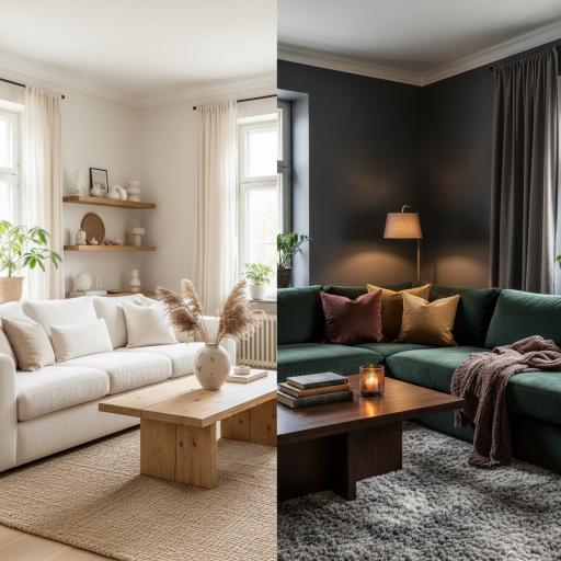
A warm white living room is the most universally appealing and enduringly popular interior color choice available, and its ability to create a sense of light, openness, and calm that suits virtually every furniture style, personal aesthetic, and lifestyle requirement makes it the default starting point for a majority of interior design projects regardless of budget, scale, or ambition. The warmth embedded in a well-chosen white, those subtle yellow, pink, or peachy undertones that distinguish a warm white from a cold, bluish alternative, does the emotional work of making the room feel genuinely inviting and human rather than clinically sterile, and this warmth becomes particularly important in living rooms where the primary function is rest, connection, and the kind of relaxed, comfortable habitation that cold colors actively discourage.
A deep charcoal living room makes precisely the opposite design statement with equal conviction and confidence, replacing the openness and lightness of white with an enveloping, dramatic depth that transforms the living room from a bright, airy space into a rich, atmospheric sanctuary of extraordinary intimacy and sophistication. The psychological effect of deep charcoal walls in a living room is one of cocooning enclosure that many people find profoundly restful and appealing, particularly in urban environments where the desire for a private, insulated retreat from the stimulation and noise of city life makes the enveloping quality of dark walls feel like a genuine luxury rather than a spatial compromise. Warm lighting in amber tones makes charcoal walls glow with a richness and depth that transforms the room after dark into something almost theatrical in its atmospheric beauty.
2. Soft Greige vs Terracotta Bedroom
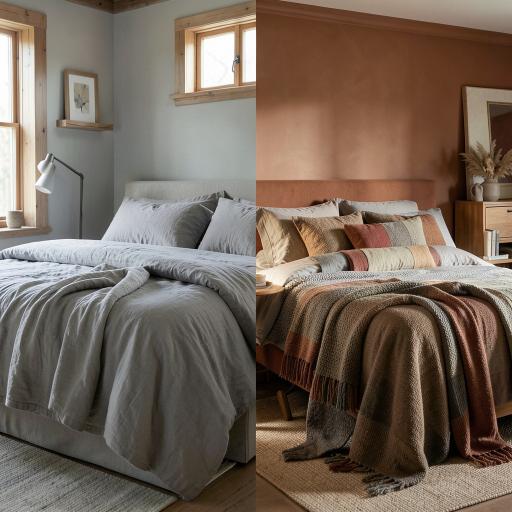
Soft greige, the warm gray-beige hybrid that has dominated bedroom color palettes for the past decade, is the most sophisticated and universally flattering neutral available for bedroom walls, and its particular quality of sitting perfectly between warm and cool without committing strongly to either makes it an extraordinarily versatile backdrop that suits every skin tone, every lighting condition, and every furniture style with a chameleon-like adaptability that pure gray and pure beige individually cannot match. The greige bedroom has a quality of quiet refinement and considered restraint that communicates design intelligence and aesthetic confidence without the dramatic statement of a bold color choice, and its popularity with interior designers working across every style and budget level reflects its genuinely exceptional versatility as a bedroom color.
A terracotta bedroom makes a statement of warm, earthy boldness that is as deeply connected to the natural world and the ancient human tradition of using earth pigments in domestic decoration as any color choice available in a contemporary paint range. The specific quality of terracotta, with its mixture of red, orange, and brown undertones that simultaneously evoke sun-baked clay, the warmth of fire, and the rich earth of a Mediterranean garden, creates a bedroom atmosphere of extraordinary warmth and sensory richness that greige, for all its sophisticated versatility, simply cannot approach. Terracotta walls in a bedroom lit by warm artificial light in the evening glow with a depth and richness that makes the room feel like a beautifully realized retreat of genuine character and cultural resonance.
3. Pale Sage Green vs Emerald Green Kitchen
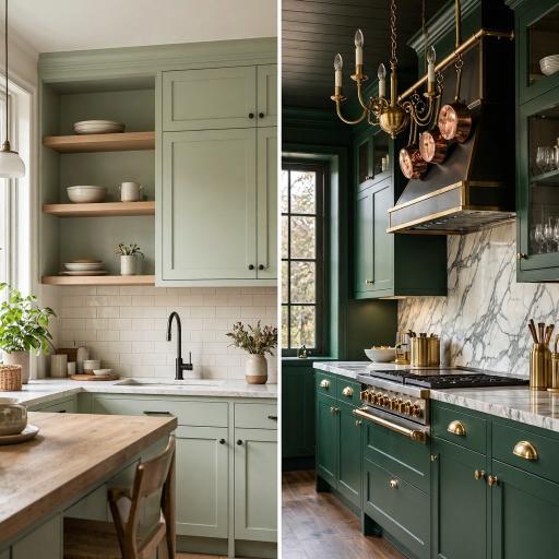
Pale sage green is the kitchen color that most successfully bridges the desire for color and the desire for calm in a single, harmonious choice, and its botanical associations with living plants, fresh herbs, and the natural world give it a quality of organic freshness and gentle vitality that makes it one of the most universally loved and Pinterest-celebrated kitchen colors of the current decade. The muted, slightly gray quality of sage green means that it reads as a sophisticated neutral in certain lights, particularly in the cooler, overcast light of a north-facing kitchen, while revealing its green character more fully in warmer light conditions, creating a kitchen color that seems to shift and evolve throughout the day in a way that most paint colors, which simply lighten and darken without changing their fundamental character, cannot match.
An emerald green kitchen is one of the most dramatically beautiful and design-confident color choices available in contemporary kitchen decorating, and its ability to transform an ordinary kitchen into a room of genuine visual power and sophistication through the sheer force of its rich, jewel-toned color makes it a perennial favorite on Pinterest kitchen inspiration boards and in the portfolios of the most respected residential interior designers. The depth and richness of emerald green on kitchen cabinets, particularly when combined with the warm metallic brilliance of brushed brass hardware and the cool luxury of white marble countertops, creates a chromatic composition of extraordinary beauty that makes every other element in the kitchen look more considered, more precious, and more worthy of attention by association with the commanding color that surrounds them.
4. Cream vs Navy Blue Dining Room
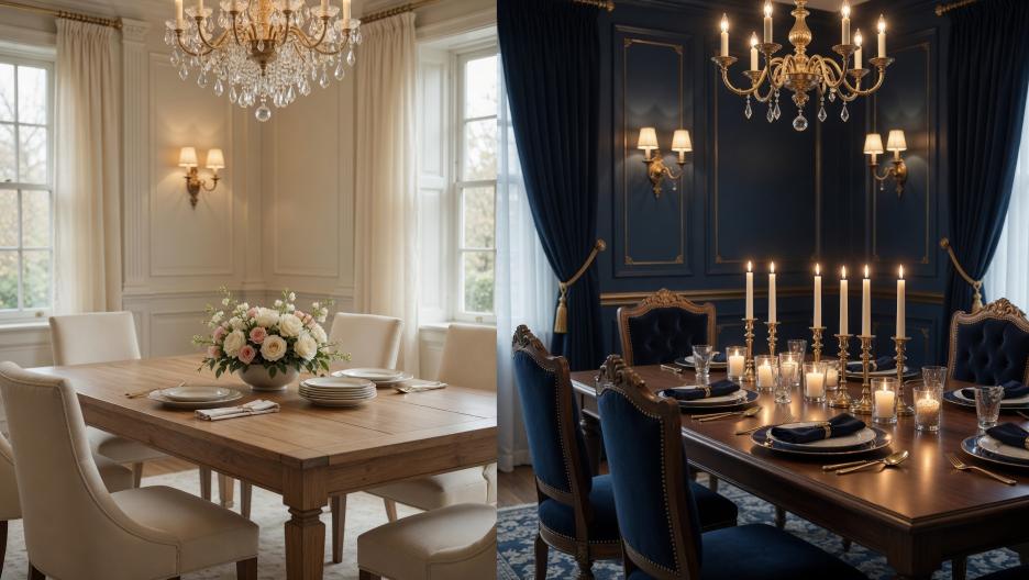
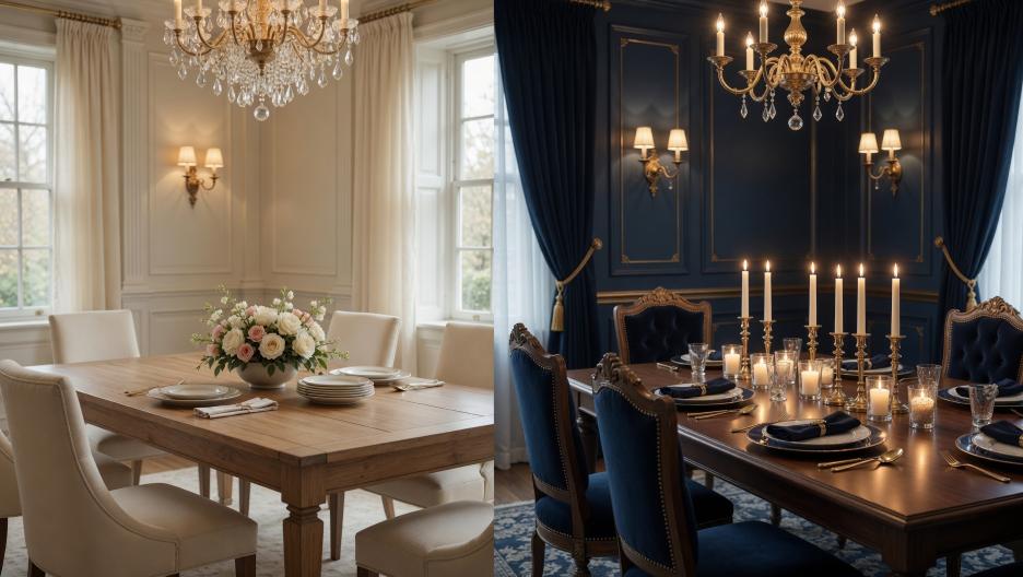
A cream dining room is the most timelessly elegant and socially flattering of all dining room color choices, and the warm, soft quality of cream walls in a room lit by candlelight or warm artificial light creates an atmosphere of effortless hospitality and refined comfort that makes every meal served within it feel more special and every guest seated at the table look more beautiful. The specific quality of cream in a dining room context, its ability to reflect warm light in a way that adds a golden glow to the faces of everyone present and makes the textures of linen, wood, and china appear more beautiful than they would under cooler or harsher illumination, makes it a color choice that is simultaneously aesthetic and genuinely social in its beneficial effects on the experience of dining together.
A navy blue dining room is the most dramatically atmospheric and luxuriously intimate formal dining color available, and the transformation that deep navy walls deliver to the dining experience is one of those interior design effects that must be experienced to be fully appreciated, creating an enveloping sense of occasion and special evening atmosphere that makes every dinner served in the room feel like a genuinely memorable event rather than a routine meal. Navy walls in a dining room lit by candlelight and warm pendant lighting take on a depth and richness that seems almost three-dimensional, absorbing and reflecting light in a way that creates shifting shadows and luminous highlights across the wall surface that make the room feel as if it is in gentle, constant movement, alive with the flickering of candlelight and the warmth of gathered company.
5. Soft Linen vs Bold Mustard Yellow Living Room
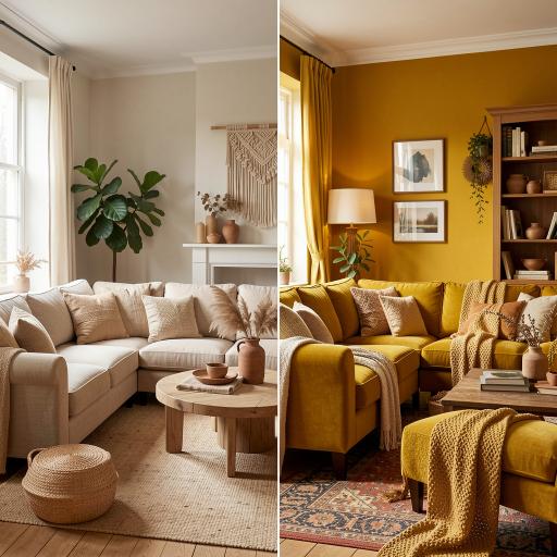
A soft linen living room is the closest thing to a perfect universal interior color that exists in the residential decorating canon, and its particular quality of warm neutrality, the color of undyed natural fiber with its subtle variation between pale cream and warm beige, creates a backdrop of such quiet beauty and organic warmth that it makes every other element placed within it, from the simplest wooden furniture to the most carefully curated collection of decorative objects, appear more beautiful and more considered than it would against any other background color. The linen-toned living room has a quality of natural, effortless elegance that is the opposite of the designed and deliberate, appearing to have arrived at its beautiful state through the natural selection of organic materials and honest craft rather than through the calculated decisions of an interior designer.
A bold mustard yellow living room is one of the most energetically joyful and visually stimulating color choices available for a living space, and its combination of warm solar energy, historical richness rooted in the ochre and gold pigments of ancient and Renaissance painting traditions, and contemporary relevance within the earthy, warm color palettes of current interior design makes it a choice that feels simultaneously classic and entirely of the moment. Mustard yellow walls in a living room create an atmosphere of warmth and optimism that is genuinely mood-elevating in a way that more restrained color choices cannot match, making the room feel like a space of creative energy and welcoming vibrancy that draws people in and encourages the kind of animated, engaged social interaction that the best living rooms are designed to facilitate.
6. Warm Gray vs Dusty Pink Bedroom
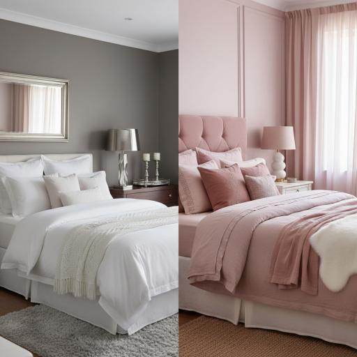
Warm gray is the most intellectually sophisticated and visually refined of all bedroom neutrals, occupying a precise chromatic position between the warmth of beige and the coolness of pure gray that makes it simultaneously versatile and distinctive, capable of reading as a warm, enveloping tone in the evening artificial light of a bedroom and as a cool, crisp backdrop in the cooler daylight hours of a morning room. The specific quality of a well-chosen warm gray in a bedroom context is one of quiet authority and considered restraint that communicates a level of design confidence and aesthetic maturity that more obviously warm or colorful bedroom choices, however beautiful, cannot quite achieve with the same cerebral edge. Warm gray bedrooms styled with white bedding, natural wood, and a small number of carefully chosen silver or pewter accents have a quality of understated luxury that is among the most admired and aspirational bedroom aesthetics in contemporary interior design.
Dusty pink is the most romantically beautiful and emotionally resonant bedroom color available, and its specific quality of warmth tempered by the gray undertone that distinguishes dusty pink from bubble gum or candy pink gives it a sophistication and depth that makes it suitable not just for feminine or romantic bedroom aesthetics but for any bedroom interior where warmth, intimacy, and a subtle sense of gentle beauty are the primary atmospheric goals. The dusty pink bedroom has been one of the most consistently popular and widely pinned bedroom color choices on Pinterest for several years, and its enduring appeal reflects a genuine and broadly felt resonance with the color’s particular combination of warmth, softness, and restrained sophistication that transcends specific trend cycles and demographic associations.
7. Off-White vs Forest Green Home Office
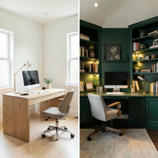
An off-white home office creates the most focused, clear-headed, and mentally uncluttered working environment available from a color perspective, and the visual simplicity of pale walls in a workspace has a well-documented relationship with cognitive clarity and sustained concentration that the more stimulating and visually complex environments created by bold color choices cannot consistently replicate for all personality types and working styles. The off-white office is not, however, simply a neutral default that represents an absence of design ambition, but rather a deliberate choice to place the visual emphasis entirely on the work being done, the objects being used, and the person occupying the space rather than on the walls that contain them, and this philosophy of self-effacing background creates a workspace of genuine focus and professional clarity.
A forest green home office is one of the most deeply nourishing and psychologically supportive color choices available for a workspace, drawing on the extensive body of research demonstrating the restorative and stress-reducing effects of exposure to green tones that are associated with nature, vegetation, and the outdoor environments in which human beings evolved to spend the majority of their time. Forest green walls in a home office create an atmosphere of calm focus and organic richness that the clinical neutrality of off-white cannot provide, and the deep, saturated tone of forest green absorbs light in a way that reduces glare on screens and creates a comfortable, low-stimulation visual environment that many people find conducive to sustained, concentrated intellectual work of the kind that home offices are primarily designed to support.
8. Stone Beige vs Cobalt Blue Bathroom
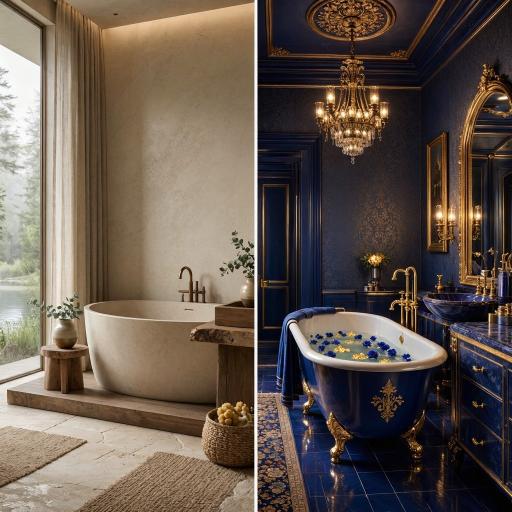
A stone beige bathroom is the most spa-like and sensuously restful bathroom color choice available, drawing on the ancient human association between bathing, the warm tones of natural stone, and the restorative qualities of a hot spring or thermal bath environment to create a bathroom of extraordinary calm and physical comfort. The specific quality of stone beige in a bathroom context, its ability to absorb and warm the steam and moisture-saturated light of a well-used bathroom in a way that makes the room feel genuinely enveloping and nourishing rather than simply functional, makes it the ideal color for anyone who approaches their daily bathing routine as a ritual of self-care and restoration rather than a purely functional hygiene exercise. Natural stone tiles in warm beige and sandy tones, combined with wooden accents and simple matte fixtures, create the ultimate organic spa bathroom of enduring beauty.
A cobalt blue bathroom is one of the most dramatically jewel-like and visually arresting interior color choices available in any room of the house, and the specific intensity and purity of cobalt blue, with its deep, saturated tone that seems to contain its own internal light source, creates a bathroom of extraordinary visual power that transforms what is often the smallest room in the house into the most memorable and design-forward space in the entire home. The association of deep blue with water, depth, and the reflective quality of still pools makes cobalt blue a particularly appropriate and resonant color choice for a bathroom, where the relationship between the color and the room’s primary function creates a sense of conceptual coherence and design intelligence that makes the color choice feel genuinely considered rather than arbitrary.
9. Warm Taupe vs Burnt Orange Hallway
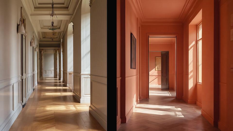
A warm taupe hallway is the most elegantly understated first impression a home can make on arriving guests, communicating a quality of sophisticated restraint and considered taste that sets the tone for the entire interior beyond without announcing itself with the overt drama or deliberate visual impact of a bolder choice. The specific warmth of taupe, a color that sits precisely at the intersection of warm brown and soft gray in a way that creates something more complex and interesting than either pure tone alone, makes it a hallway color of genuine sophistication that improves with acquaintance, revealing its subtle depth and warmth more fully as eyes adjust from the cooler light outside to the warm interior light of the home. A taupe hallway with warm wooden floors, a large mirror in a simple frame, and a single well-chosen light fixture creates one of the most timelessly elegant entrance compositions available.
A burnt orange hallway is the most dramatically welcoming and emotionally generous entrance color available, wrapping arriving guests in a warm, enveloping embrace of fire-toned color that immediately communicates a quality of warmth, hospitality, and bold aesthetic confidence that no neutral hallway color can approach with the same physical and emotional immediacy. The burnt orange hallway is a commitment, a statement of design personality that signals to everyone who enters the home that the people who live within it are not afraid of color, not bound by conservative decorating convention, and entirely confident in their aesthetic choices, and this quality of expressed conviction in a color choice is itself a form of interior design sophistication that speaks more eloquently about the character of the household than any quantity of tasteful neutral choices could achieve.
10. Pale Blue vs Deep Teal Living Room
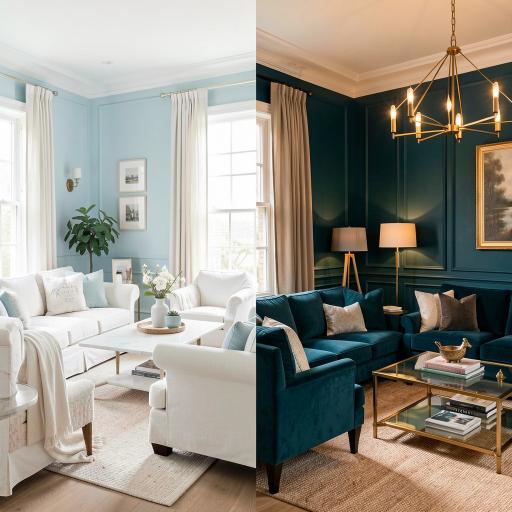
Pale blue is the most serenely restful and psychologically calming of all living room colors, and its association with clear skies, calm water, and the restorative quality of open, airy outdoor environments gives it a particular ability to create a sense of mental spaciousness and emotional ease in a domestic interior that most other colors, however beautiful, cannot replicate with the same effortless consistency. The pale blue living room has a quality of light-filled openness that makes it feel larger and more airy than its physical dimensions objectively support, and this combination of genuine restfulness and apparent spatial generosity makes it an especially valuable color choice for living rooms in urban apartments or compact houses where the desire for a sense of expansiveness and outdoor connection is greatest and most difficult to achieve through architectural means alone.
Deep teal is one of the most sophisticated and chromatically complex of all living room color choices, sitting at the precise junction of blue and green in a way that creates a color of extraordinary richness and depth that seems to contain within it the quality of both sea and forest simultaneously. The specific character of deep teal in a living room, particularly when combined with warm gold or brass accents and the soft glow of warm artificial lighting, creates an atmosphere of dark, rich luxury that is among the most admired and aspirational interior aesthetics in contemporary design culture, occupying a unique position between the cool sophistication of deep blue and the organic warmth of deep green in a way that gives it a distinctiveness and chromatic personality that neither parent color possesses on its own.
11. Neutral Linen vs Plum Purple Bedroom
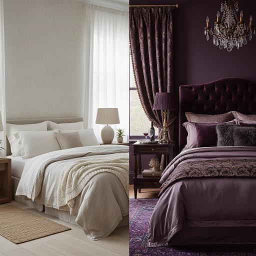
A neutral linen bedroom achieves what very few interior color choices can manage, the quality of feeling simultaneously simple and rich, effortless and considered, modern and timeless, in a combination that makes it one of the most enduringly satisfying and livable bedroom colors available to anyone decorating a room where the primary goal is genuine daily comfort and restorative rest rather than dramatic visual impact. The linen bedroom in its most beautiful form is a study in tonal and textural layering within a narrow warm neutral palette, with the wall color, bedding, curtains, and natural materials of the furniture all existing within a few closely related warm tones that create a unified, seamless environment of remarkable calm and organic warmth that feels genuinely restorative to inhabit.
A plum purple bedroom is the most decadently luxurious and historically resonant of all bedroom color choices, drawing on the ancient associations between purple, royalty, wealth, and sensory richness to create a sleeping environment of extraordinary visual and emotional depth that makes every other bedroom color, however beautiful, seem somehow modest and understated by comparison. The specific quality of plum in a bedroom context, its combination of red warmth and blue depth in a tone that seems simultaneously passionate and mysterious, creates an atmosphere of intense, enveloping richness that is deeply conducive to the transition between waking and sleeping states, wrapping the sleeper in a color whose depth and warmth seems to encourage the letting go of the day’s concerns and the surrender to rest that the bedroom is designed to facilitate.
12. Soft Ivory vs Racing Green Study
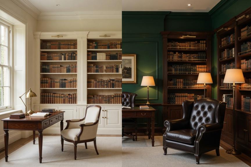
A soft ivory study is the most classically scholarly and intellectually focused study color available, its warm, parchment-like tone evoking the accumulated pages of a lifetime’s reading and the gentle, diffused light of a traditionally furnished library in a way that creates a working environment of quiet cultural richness and focused calm. The ivory study has deep roots in the tradition of the English country house library and the continental European scholar’s cabinet, spaces where the primary function of concentrated intellectual work was supported by an environment of warm, unhurried calm in which books, natural light, and the warm tones of aged paper and polished wood created an atmosphere of learning and contemplation that continues to resonate powerfully with anyone who values reading, writing, and sustained intellectual engagement as central activities of a well-lived life.
A racing green study is one of the most dramatic and atmospherically potent room color choices available in any category of interior design, and its combination of deep chromatic richness, strong associations with traditional English interiors and the masculine aesthetic of a gentleman’s club or private library, and genuinely beautiful interaction with warm artificial light and aged leather furniture creates a study of extraordinary character and visual authority that makes working within it feel like a genuine privilege. Racing green walls lined with bookshelves, warmed by the glow of a brass desk lamp and the light of a standard lamp in one corner, and furnished with a leather armchair in a complementary cognac or aged tan tone create one of the most universally admired and Pinterest-celebrated interior compositions available in the entire domestic decorating canon.
13. Warm White vs Midnight Blue Kitchen
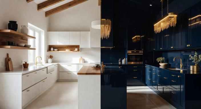
A warm white kitchen is the most timelessly practical and universally flattering of all kitchen color choices, and its combination of genuine brightness, easy maintenance, complete compatibility with every countertop material, hardware finish, and flooring type, and the quality of making the kitchen feel larger and more light-filled than its physical dimensions objectively support makes it the single most consistently recommended kitchen color by interior designers working across every style and budget level worldwide. The warm white kitchen is not, however, simply a safe default that represents a failure of color imagination, but rather a positive and deliberate choice to create a kitchen of maximum luminosity, visual calm, and long-term flexibility that will suit the household’s evolving aesthetic preferences and practical requirements over decades of daily use without ever feeling dated or limiting.
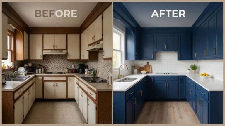
A midnight blue kitchen is one of the most dramatically beautiful and design-forward kitchen color choices available in the contemporary decorating landscape, and its ability to transform a practical cooking space into a room of genuine visual drama and sophisticated atmosphere makes it one of the most admired and aspirational kitchen colors on Pinterest and in the portfolios of the most celebrated residential kitchen designers. The depth and intensity of midnight blue on kitchen cabinets, particularly in the context of a well-lit kitchen with warm natural or artificial light, creates a color experience of extraordinary richness and dimensionality that makes the kitchen feel like a genuinely designed space of considered intention rather than a functional room that has simply been painted and fitted with appliances.
14. Greige vs Burnt Sienna Dining Room
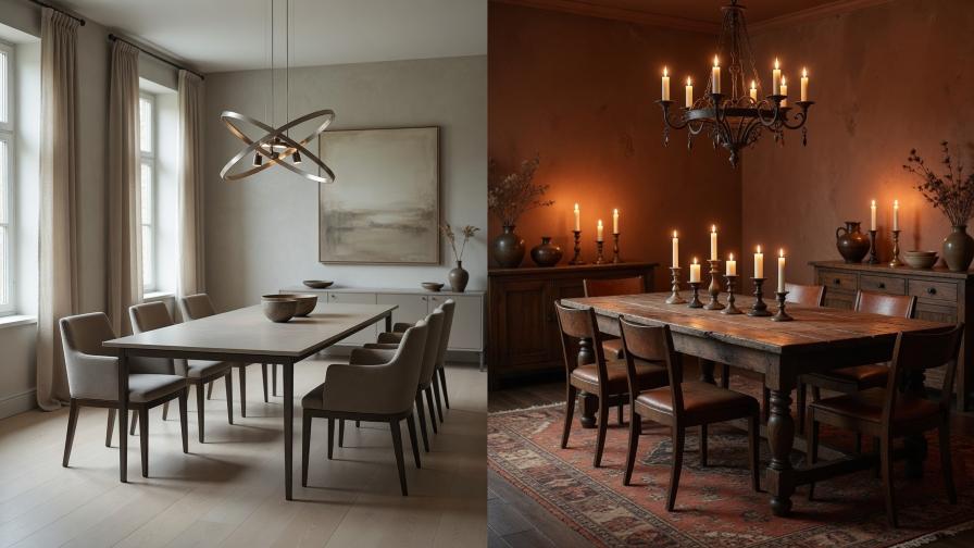
A greige dining room achieves the rare quality of feeling simultaneously modern and timeless, sophisticated and approachable, designed and effortless in a chromatic balance that makes it one of the most consistently successful and genuinely livable dining room color choices available. The specific quality of greige in a dining room context is its ability to provide a warm, flattering backdrop for every skin tone, textile, and material it encounters, making both the people seated at the table and the objects placed upon it look more beautiful than they would against a cooler or more chromatic background color. This socially flattering quality, combined with the visual sophistication and design neutrality that allows greige to work with virtually any furniture style from sleekly contemporary to warmly traditional, makes it one of the most practically intelligent dining room color choices available.
A burnt sienna dining room creates one of the most sensuously beautiful and emotionally nourishing dining environments available in the entire range of interior color possibilities, drawing on the deep human association between terracotta-toned spaces and the warmth of Mediterranean domestic life, the ancient tradition of earth-pigmented interiors, and the rich, appetizing quality of warm, orange-toned colors that are consistently documented to stimulate appetite, encourage conversation, and create an atmosphere of generous, convivial hospitality. The burnt sienna dining room lit by candlelight is an interior experience of profound beauty and warmth that makes every meal served within it feel like a celebration and every guest seated at the table feel genuinely welcomed and cared for in a way that cooler or more neutral dining room colors, however beautiful, simply cannot achieve with the same visceral, physical immediacy.
15. The Final Choice: Matching Color Confidence to Your Life
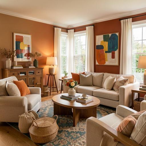
The most important and most liberating principle in choosing between neutral and bold color for any room in your home is the understanding that the correct color is not determined by trend, by what works in a photograph, or by what an interior designer would recommend in the abstract, but by the specific combination of practical requirements, personal temperament, and daily lived experience that defines your particular relationship with the spaces you inhabit. A bold color that energizes and inspires one person may overwhelm and exhaust another, and a neutral palette that feels serenely beautiful to a person who loves calm, uncluttered environments may feel cold and impersonal to someone who is nourished by color, pattern, and visual richness. The only color that is definitively correct for any room is the one that makes the person who lives in it feel most genuinely at home.
The practical path to discovering your own color confidence begins with honest observation of the colors that consistently attract you in the world outside your home, the rooms you linger in and remember from hotels, restaurants, and friends’ houses, the palettes of the artworks and photographs that move you most, the colors of the landscapes and natural environments that restore and inspire you most powerfully. These preferences, consistently expressed across the many different contexts in which you encounter and respond to color throughout daily life, reveal a personal color intelligence that is more reliably trustworthy than any trend report or design rule, and building your home’s color story from this foundation of genuine personal resonance rather than borrowed aspiration or safe convention will always produce interiors of greater beauty, authenticity, and daily satisfaction than the most expertly executed version of someone else’s color vision could ever achieve in spaces that are ultimately, and most importantly, yours.